 Skip to the content
2022 Digital Design Award: Creating Award-Winning Websites for Our Clients
When we embark on a new website with a client, our goal is to create something functional, visually appealing, and conveys the client’s products and services. And sometimes, the final product is just really awesome — like in the case of National DCP’s brand new website. We’re also proud to say it won a design award in the process!
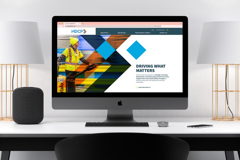
National DCP is known as a major player in the foodservice industry when it comes to managing supply chain and logistics. They’re best known for their partnership with Dunkin, but offer a full suite of services that would suit just about any foodservice business. In fact, according to the International Foodservice Distributors Association, National DCP is the 13th largest foodservice distributor currently operating in the United States. Looking at their old website, one would have never guessed.
Their old site was outdated, and didn’t convey the impact National DCP has on the foodservice industry. National DCP’s leadership recognized a need for a new website — which is where Hammer Marketing came in.
As we started the design process, our Senior Designer, Kyle Huntzinger, was immediately struck by the color palette of National DCP’s brand. When an organization has a strong brand and an established aesthetic, like National DCP does, it often sparks inspiration. The bold colors from their palette lent themselves to a bold design, which got Kyle thinking: how else could we convey this brand’s personality through the website?
He started to play around with off-set grids and color overlays, utilizing current trends in web design. In partnership with our Senior Developer, Lee Gustin, they added in fun little details that added a sense of whimsy and interactivity to the site. For example, whenever someone hovers over a button, the square next to the text rotates and the text changes color. Simple, yet unexpected. It’s an effect that’s carried throughout the entire website, ensuring that every interaction has some character to it.
However, there was one slight hiccup: we realized that the color palette, as fantastic as it was, would not comply with accessibility standards. The bright colors of the palette needed more contrast. To remedy that, Kyle tweaked their brand palette so the website would be accessible to all users.
Finally, we wanted customers to journey through the website seamlessly. We restructured the website’s site map and information architecture to encourage users to take the path that most aligned with their interests. Functional and fresh — just like National DCP.
By the end of the project, we created a website that not only told the story of what National DCP does and how it does it, we brought its brand to life. The site invites users to learn more, join the team, and makes it easy to find information. Current customers can log in to their portal while prospective customers are treated to a clean, aesthetically pleasing website. Throughout, National DCP’s brand is clear, telling its story in such a way that immerses the user and creates a human connection.
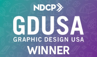
This site felt pretty special — so we entered it for consideration in the GDUSA’s 22nd Annual Digital Design Awards. The award competition recognizes design and the ways in which it enhances online and interactive experiences. We felt that National DCP’s website demonstrated modern design principles in a compelling and engaging way and was a worthy contender.
Clearly, GDUSA felt the same way! Receiving the design award is both a thrill and an honor. We’re delighted that we were able to showcase our design and development expertise to benefit our partner, all while gaining greater recognition within our industry.

About the Author:
While his title may be Art Director, Kyle’s talents transcend digital and traditional media. His specialties and areas of interest including branding, logo design, print design, website design, and UI/UX design.
