Designing and Developing with Accessibility in Mind
We are not all the same — which means, not everyone will be using that fancy new website you designed and built the same. This is why we need to be designing and developing with accessibility in mind. For example, Sarah has cerebral palsy and operates her touch device with her head. Paul has arthritis and it is easier for him to navigate through a website with his keyboard. George has a limited field of vision and zooms his browser to 300% in order to see content on the page.
These are just a few scenarios to think through when designing and developing a website and the following article contains tips on how to be inclusive of everyone browsing the interweb — no matter how they do it.
The Colors Duke! The Colors!
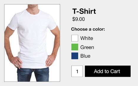
Don’t rely on color alone — many people are affected by color-blindness and vision related problems, which makes it difficult for them to functionally use websites that rely too heavily on color alone. For products with multiple color options, such as a t-shirt, combine the color swatch with the name of the color.
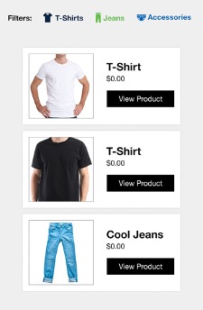
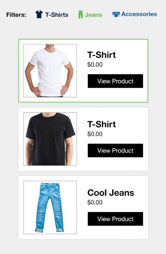
Another area where we need to keep this in mind would be category filters. If we rely solely on a different color for each category, users who are color blind will not be able to distinguish between categories.
However, if we were to pair different icons with the colors, this would be one way to solve the issue:
Crank Up the Contrast
Contrast on the web is measured in ratios — text to icons; large to bold text. Here are some key ratios to keep in mind while designing and developing:
· Meaningful text, icons, graphics – minimum 4.5:1
· Large or bold text – minimum 3:1
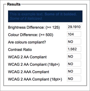
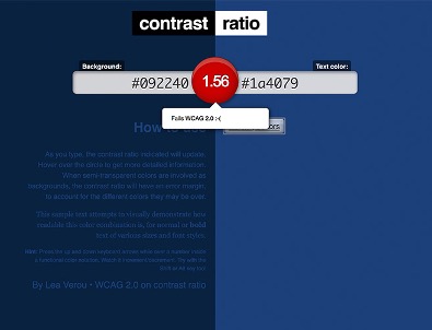
· When it comes to color contrast, use these helpful online tools to check the contrast between colors:
- Meaningful text, icons, graphics – minimum 4.5:1
- Large or bold text – minimum 3:1
- When it comes to color contrast, use these helpful online tools to check the contrast between colors:
Proximity. Proximity. Proximity
Always consider people with a limited field of vision (ex. for e-commerce, when adding something to the cart, have the message pop up near the button, change the text in the button to say “added,” or have a number travel from the button to the cart). Make sure that all important response related information is located close enough to where the user performed the action.

The Keyboard is Key
Some users need to utilize a keyboard to navigate the internet, as it is very painful to use a mouse. Here are some tips when designing with keyboard users in mind:
- Use focus indicators for keyboard users (active state vs. inactive state)
- Ability for users to tab through all elements on the page that a typical user clicks on
Touch-y Subject
When designing an interface, remember not everyone will use the touch screen the same way as you.
The best sources to understand gestures for assistive technologies on touch screens — Google, Apple, and Microsoft’s documentation.
- Make sure that a gesture you want to use doesn’t conflict with a gesture in use by assistive technology
- If it is, revise the design to accomplish the same action
- Think about how people are going to use the content
- Make buttons and targets big enough with ample space between (ex. Pagination)
- Different guidelines for target sizes on mobile devices from the “Big 3”
- 34×34 – Microsoft, 44×44 – Apple, 48×48 – Google
Media Content Everywhere
When looking at the website you’ve built/developed, carefully scan through the pages and wherever you see an image, logo, button, etc. ask yourself one question — If this media were gone, would the meaning of the content be changed? If the answer is yes, then it is important and needs a text equivalent.
Media on a website can fall into 3 categories:
- Informational – Important in and of its own right, where important information is contained in that image, video, or audio. This content needs a text equivalent. (image of t-shirt on e-commerce site, podcast episode audio, etc.)
- Functional – Includes images that are part of links, or form controls, and that are used for navigation, or for performing tasks within the browser. (ex. Logo in header, play button, etc.
- Decorative – Not really important to the page. Does not need a text equivalent.
Remember: Images and video/audio clips need text equivalent to go along with them.
- Figure out the purpose of the visual — figure out which parts are decorative and which are functional
- Utilize tags and labels to ensure important information is conveyed to the user through assistive technologies
- Aria-label=”” – Allows assistive technologies to announce the selection when a blind person is reading a page
- Alt-tags – they should convey the same messaging that is shared visually
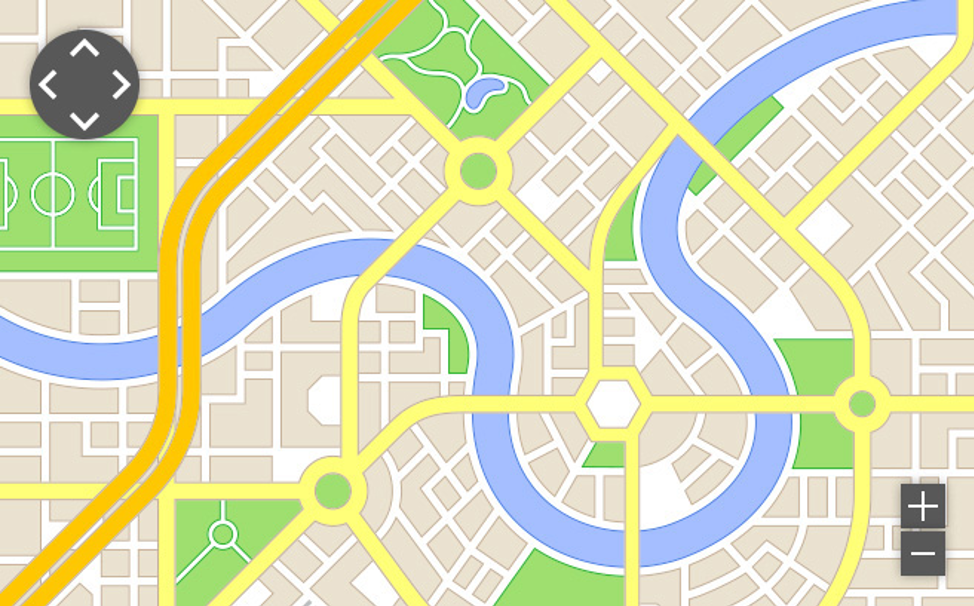
Take the above map for example — the functional buttons (pan left, pan right, zoom in, zoom out) are all functional buttons and need text equivalents. Also, the locations associated with the map should have text equivalents listed somewhere close by.
Form Fields – Label ‘em!
Benefits of labels
- Labels help assistive technology form a programmatic relationship between label and field
- Clearer prompts for the user
- For someone with memory issues, it helps them remember what field they’re currently filling out
Every form field needs a <label>. This allows a screen reader to tell the user what kind of field it is and what action they can perform. This also allows the user to click on the field name to activate field — giving them a larger target area.
For address with 2 fields, utilize aria-label (hidden label).
Another aspect to be mindful of while building forms is placeholder text. This text instructs the user as to what information they should put into the respective fields. Make sure placeholder text is persistent — Keep them visible even after the user starts typing (for people with memory issues, etc.)
Placeholder text is a necessity, but avoid using form field titles as your placeholder text (see example below)
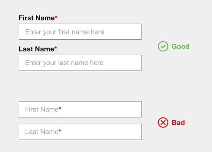
Here are some of the problems that this presents to the user:
- Disappears
- “is this already filled out?”
- Lighter color (contrast issues)
- Fields often left unlabeled
Other helpful tags you can use are HTML5 form types – these trigger special keyboard functions which are helpful on mobile devices.
- Tel
- URL or email
- Number
- Date
- Search
For example, the “tel” type tells your mobile device to trigger the number pad, rather than the full qwerty keyboard.
Validation and errors are also key components of form fields. Remember the following when designing and building forms into your website:
- CONSISTENCY IS KEY — make sure your validation/error messages are placed consistently
- Pair your validation/error messaging with an icon and color
- Make sure it’s visually close to the corresponding field
- Simple messaging
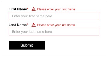
Things to consider – How will it work with longer messages? How will it respond to text resizing? How will it work in another language?
Flexibility and Accessibility
Which resolution do we design for? All of them.
Why does everything have to be responsive? Why can’t we just design fixed layout websites like the good ‘ole days? Well, for starters, fixed layouts don’t respond well to text resizing. They also produce horizontal scrollbars when the window is resized, causing major accessibility concerns. Responsive design reflows and resizes certain elements on the website on different size screens so that your experience is as seamless as possible no matter what device you’re using.
When adapting your website to a mobile layout, remember, Linear order matters to someone not navigating the website using traditional means — make sure your content follows in a logical, linear order on all screens.
Below are some things to keep in mind for successful responsive design:
- Reflow multicolumn forms to single stack on mobile
- Prioritize content for smallest size — if it’s not important at the smallest size, why should it be present in the larger design?
- Allow for pinch/zoom
Height matters too; design for flexible height as well as width.
Structured Content
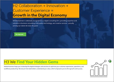
To create a successful flow of content, establish hierarchy in your headings. This ensures that the user is getting the most pertinent information from the page, even if they read the headings and nothing else.
Tip: There are various tools that can help you better understand hierarchy and structure when it comes to page headings. One such chrome extension that can be of help is called “H-tag” and we recommend taking a look.
Page Titles are also an important element that often is overlooked.
- This is the first thing announced by a page reader — Make it count
- Make sure each page has its’ own title
- Distinguishing information first – site name
- Make sure it reads similarly to the H1 on the page
So… Now What?
There is obviously much, much more to learn when it comes to designing for accessibility, but everything in this article should provide you with a head start. The web is a beautiful thing and we need to make sure we’re allowing everyone to experience it as similarly as possible.
Contact us to see how we can help.
